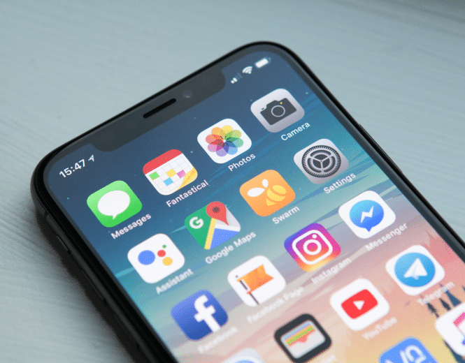
To make your mobile app user experience (UX) truly seamless, everything from onboarding to checkout needs to work perfectly. Usability is a big part of the user experience and plays a major role in experiences that are efficient, pleasant to use, and enjoyable. Overlooking something as simple as navigation on a mobile app can impact the UX negatively, which will be the difference between a returning user and a deleted app. Put simply, if your app is useful and valuable to the user but requires a lot of time and effort, people won’t bother learning how to use it.
What is Mobile App Usability?
Many people confuse user experience design with usability and vice versa. However, mobile app usability refers to the ease of access or effort it takes for a user to complete their goal.

Mobile App Usability Requirements
There are many factors that contribute to a mobile app’s usability that will impact the overall efficiency and effectiveness in which a user completes their goal. A usable interface should have three main outcomes:
- It should be easy for the user to become familiar with the UI
- It should be easy for users to achieve their goal when using the app
- It should be error-free. If your app doesn’t work to begin with, the rest of your UX elements will not matter

In a world dominated by smartphones, finding a way to interact and engage with customers is becoming increasingly important. While the user interface is a crucial part of the UX, usability should always take precedence. If an app is aesthetically pleasing but difficult to use, the overall user perception of your app will be negative as a result. Here are 7 mobile app usability issues that are often overlooked in mobile app development:
1. Platform Usability
A common frustration for mobile users is not having an app thats works for their specific model of smartphone. Android and iOS, for example, are two different platforms. You can’t simply clone your iOS app for Android and vice versa. Android comes with an entirely different set of programming, design, and user interface considerations. For example, navigation for each platform differs quite significantly. iOS for one, doesn’t have a “back” button like Android.
With that in mind, you should tailor your app to work within the native Android experience so your users can interact intuitively. It’s a good idea to budget for this so that you can ensure your app is optimized for the most common Android smartphones.
2. Provide Value Right Away
If you want new users to return to your app, you need to make sure that they discover the value early on, preferably during the onboarding process. If you don’t convince them to return within the first week, you’re likely going to lose them forever. The market is saturated with thousands of apps competing for the attention of your users so make sure you offer value right from the start.
Great user onboarding not only lowers abandonment rates, but can also help boost long-term success metrics like user retention and user lifetime value.
3. Simple Navigation
One of the main issues that users have when using mobile apps, particularity m-commerce ones, is poor navigation. This means that while they are using the app, they have difficulty finding what they are looking for, and have to navigate too long to find it. When a user first downloads your app, they need to clearly understand how to navigate in order to complete their goal, whether that’s booking an appointment, purchasing a product, or finding information. This means that your navigation should have as few barriers as possible. Many apps include unique features but struggle to fit them together in a way that makes sense for the user. The navigation should be comprehensible for the user so they won’t end up lost on a random page.
When focusing on usability, make sure that your products and/or services are extremely easy to find. The more complex it is for users to navigate the app, the higher the rate of user abandonment.
4. Clear & Concise Content
It’s common knowledge to simplify content when designing for mobile. However, you need just enough content that is essential to the user in order to complete a goal. This is particularly true for a buying process. Consumers still need complete information to make their purchase, and withholding basic information will result in a lower conversion rate. You should be tailoring your content for mobile, rather than copying it verbatim from web. Including too much information in your mobile app will undoubtedly result in a poor user experience with frustrated users digging to find what they’re looking for. Make it as easy as possible for the user to consume your content with as little pinching and zooming as possible by presenting the information in a clear and concise way.
5. Minimize the Number of Steps
The fewer steps, pages, buttons, and fields to input data, the better. Every time your user needs to complete an action, check to see if there’s a simpler way that would make their experience easier. Consider each action you require of your user as an added barrier. The fewer steps you include, the closer your users are to completing their goal.

Make sure they can store their billing and shipping information and then have it be automatically added to their orders, without having to re-add it each time. Also, provide them with an accessible edit button during the checkout process so they can easily change their billing or shipping info. For m-commerce or retail apps, in particular, checking out can be frustrating. You have to type in your address, email address, confirm that you selected the right product, etc.- all while using a small screen. One effective approach is to make it simple to create an account with a Facebook login. Designing your app with a convenient guest checkout option will also encourage users to make more purchases in less amount of time. Other important features to consider during development are using an autofill and large checkout buttons. These design elements will amount to a seamless path-to-purchase and overall satisfaction with the user experience.
6. Reduce Scrolling
Content prioritization also contributes significantly to the usability of an app. Users should get most – if not all – of the information they need to make a decision within the limits of their screen. Scrolling down is sometimes unavoidable and required in a number of instances, but side scrolling is something that should definitely be avoided. If a user needs to scroll sideways, it typically means that valuable content is being hidden.
7. Consider Landscape Orientation
When developing a mobile app, many people don’t consider landscape orientation as important. A good mobile app should be designed for both portrait and landscape to accommodate for optimal usability and user experience, particularly for an app that contains video content.
User Testing & Feedback
The most important thing you can do to test usability is to use mobile A/B testing platforms such as Leanplum. A/B testing allows you to compare two or more variations of a particular app design or layout. For instance, you can test the effectiveness of buttons and how they differ in driving conversions. Which design layout do your users convert more with? Instead of guessing what users prefer in your mobile app, test to validate these assumptions. To improve mobile app usability, you cannot overlook testing.

A mobile app’s success hinges on just one main thing: how users perceive it. The usability contributes directly to how a user feels about your app- whether negative or positive- as they consider the ease of use, the perception of the value, utility, and efficiency of the overall experience. Usability is what will help convert users into loyal, long-term customers, in turn, generating more revenue for your app.
SOURCE: https://clearbridgemobile.com/7-best-practices-to-overcome-mobile-app-usability-issues/


